When it comes to using my favorite apps, I'm definitely a creature of habit. No matter whether I'm using Spotify or TikTok, when I boot up an app that is part of my daily routine, muscle memory just takes over and I don't even really have to look at the part of the screen I'm tapping to pull up the content that I want, it just sort of happens.
YouTube TV's mobile app has gotten a UI refresh
More information is now available in the Live TV tab

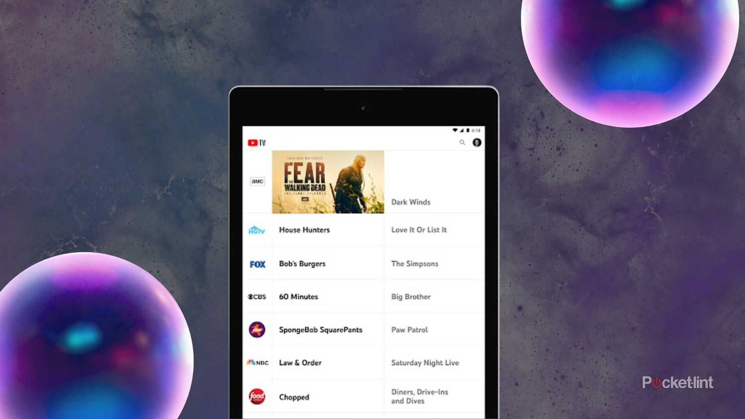
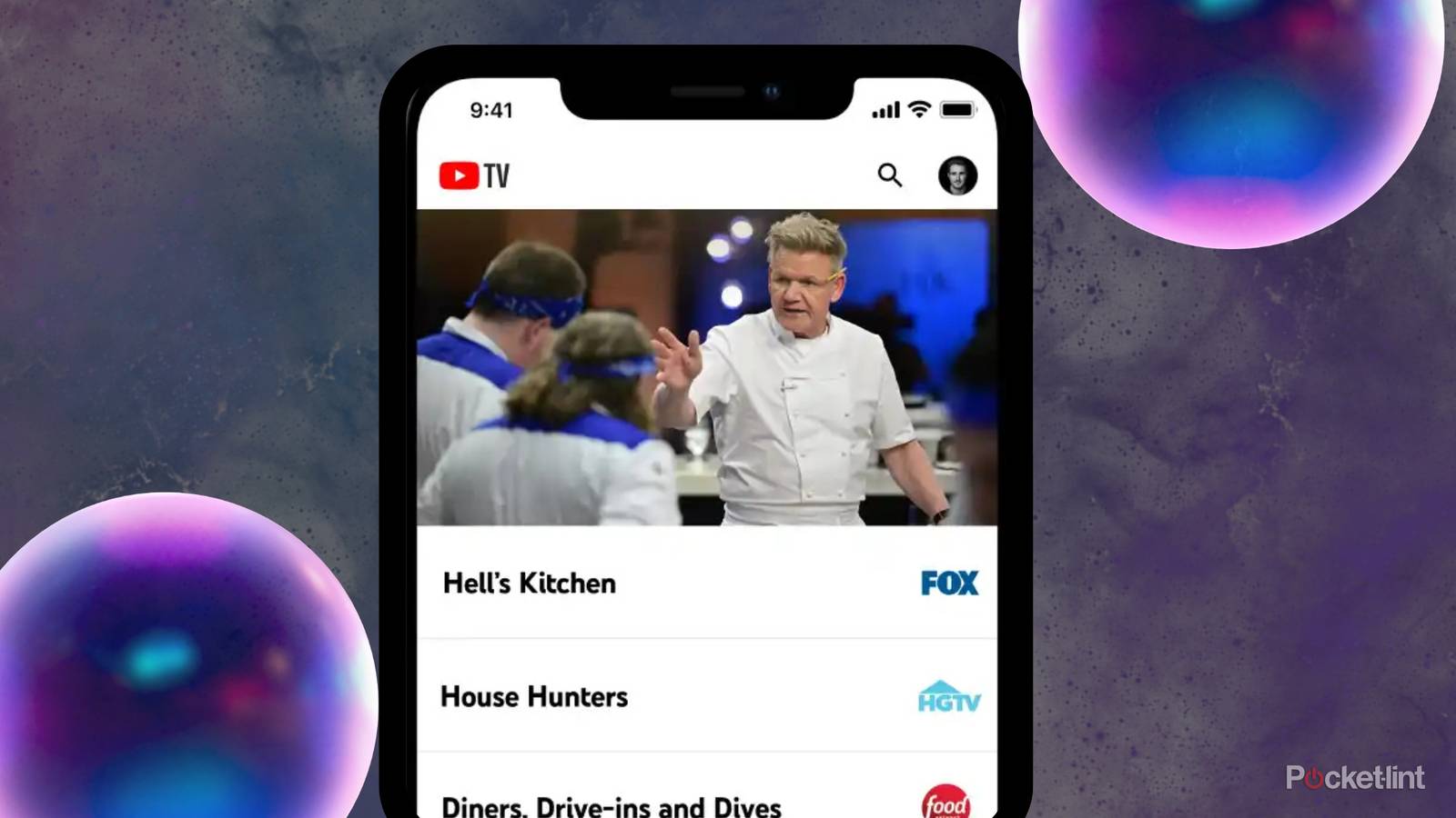
As first spotted by Android Authority, the YouTube TV mobile app's Live TV tab has gotten a bit of a refresh. Previously, when users tapped this tab they would find a list of currently-airing shows with the channel name and logo located on the right and a preview of the channel on top.
However, with the new interface, the channel name and logo have been made bigger and moved to the left side, and more information is now displayed in a bubble that includes start and end times for whatever is playing, as well as a timer that counts down to the end of the show.
Because of all the new information, the preview that used to play on top of the guide has been axed, and users now have to long-press on a channel name to see a preview bubble that will display whatever is playing on that channel. In addition to showing video, users can access quick actions in this bubble, including adding a show to your library and setting a reminder.
In addition, the sort channel option has shifted from the right side of the screen over to the top-left corner right above where the channel logos are.

Interestingly, it looks like this update has not rolled out to all mobile devices yet, so if you haven't spotted these changes you might still have the old version for a few days longer. But I fully expect this new Live Tab design to become the standard across all devices and platforms in the very near future. Currently, the TV app for YouTube TV remains unchanged.

