Microsoft is currently in the process of rolling out its latest Windows 11 version 25H2 update to eligible PCs, and, alongside this platform upgrade, the company is also trickling out a variety of user-facing changes and improvements to the operating system.
The Start Menu has been an iconic staple of the Windows experience dating back to 1995. Over the years, it's been overhauled a number of times, while continuing to serve as a one-stop-shop location for launching software, controlling a PC's power state, and searching for files and settings.
...with this aforementioned redesign now rolling out, everything changes.
Windows 11's variant of the Start Menu, which debuted in 2021, has been controversial from the get-go, with criticisms levied over its simplistic design and its lack of interface flexibility. I've personally never been the biggest fan of the Windows 11-era Start menu, but, with this aforementioned redesign now rolling out, everything changes.
Here are three reasons why I find Windows 11's all-new Start Menu to be a major glow-up over its direct predecessor, even if I still somewhat miss legacy versions of the interface from back throughout Windows' storied history.
It's more customizable
The new Start Menu finally conforms to your preferences

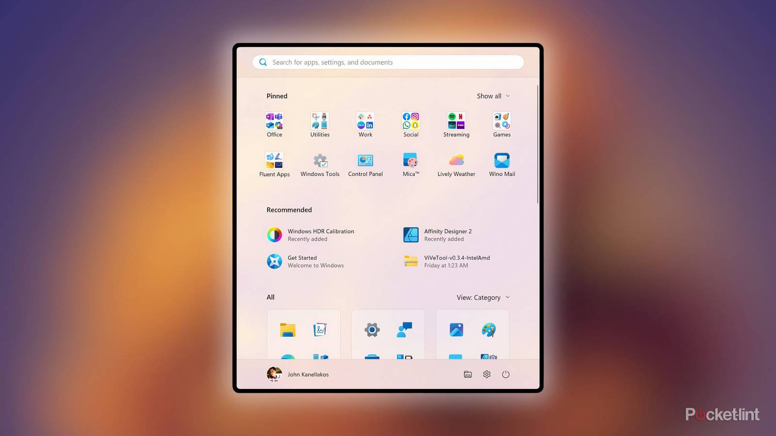
From the outset, Microsoft has been clear that Windows 11's upgraded Start Menu privileges user customizability to a greater degree than its predecessor. The controversial Recommended section is now fully removable for folks that find it superfluous, the All Apps section can be sorted via new grid and category views and will remain persistent with users' selections, and pinned apps can now be loaded up on a single, scrollable page. These pins can even be removed outright, and the number of pins shown by default is also configurable right from within the menu itself.
Of course, not everything is perfect: there's still no option to manually create app groups a la Windows 10, and the new All Apps view is susceptible to being obfuscated if the user places many pinned apps near the top of the menu. Even still, the new modularity of sections within WIndows 11's new Start Menu is a marked improvement on the whole. There's no more ugly wall of text suggesting enabling recommendations, and app pinning is a lot more organic and flexible by design.
It makes better use of space
The new Start Menu adapts to different PC screen sizes

Back in the Windows 10 days, it was easy to resize the Start Menu both horizontally and vertically, and there was even a full-screen option which offered a more tablet-like experience for users who prefer touch input. While these functionalities continue to be absent in Windows 11, the newly refreshed Start Menu does at least adapt dynamically based on screen size, resolution, and scaling.
On smaller displays, the new Start Menu sizes itself to roughly match the previous Windows 11 menu, with six columns of app pins, two columns of recommended items, and three columns of All Apps categorization folders. When the system detects a larger monitor (or a smaller scaling), then it'll automatically enlarge itself to accommodate eight columns of pins, three columns of recommendations, and four columns of categorized apps.
When coupled with the automatic removal of the Recommended section when no entries are available, and the moving of the All Apps section to the main Start Menu page itself, it's certainly clear that this new menu makes far better use of screen real estate than the outgoing Windows 11 variant ever did.
It acts like a proper app drawer
The new Start Menu is finally a streamlined app launching interface

The Start Menu is a rather resilient piece of user interface design, continuously evolving with the times to accommodate changing user habits. What was once a context menu-esque list of cascading program, file, and setting entries has been adapted into what can essentially be described as something akin to a modern-day smartphone launcher. While some power users will scoff at this development, it makes a ton of sense in today's mobile-first era of computing.
From my perspective, Windows 11's original Start Menu wasn't an ideal embracement of the app launcher model we've become familiar with on Android (via its app drawer) and iOS / iPadOS (via its App Library). It hid the All Apps settings behind a button or swipe, and it placed too much emphasis on pages of pinned app icons and folders. With most PC users pinning apps directly to the taskbar, and with many even relying on desktop shortcuts to launch programs, there's hardly a need to muck up the Start Menu with so many pinned apps by default.
Thankfully, Microsoft's upgraded Start Menu solves this problem in its entirety. With its top-level list of All Apps, its ability to sort by alphabetical list, alphabetical grid, and category view, and its de-emphasizing of the Recommended and Pinned sections, we finally have a Start Menu that serves as a proper PC app drawer. Best of all, it's still possible to pin frequent apps or folders to the top of the menu for quick access if desired, which is something I've seen a growing number of phone and tablet makers also include in their third-party Android skins.

